STUDIO INSIGHTS — PERSONAL
What 20 Years of Painting Taught Me About Web Design
BY DEANNA · 8 MINUTE READ
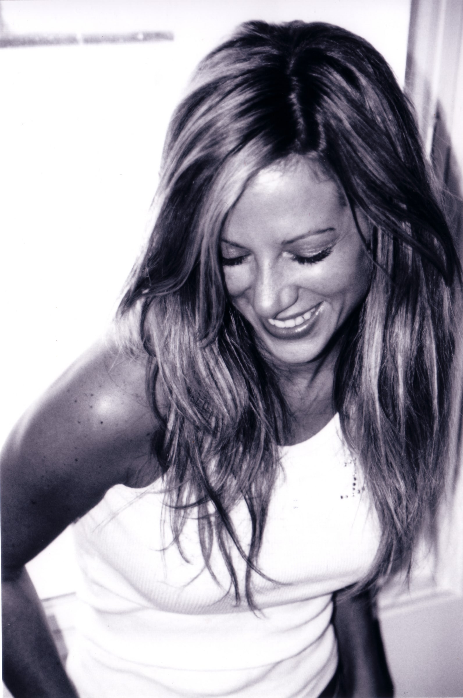
SELF PORTRAIT · EARLY PAINTING YEARS
I — THE BEGINNING
An easel, and the language I didn’t have
I was in my twenties when my mom bought me my first floor easel. It was a simple gesture, but it changed everything.
I had been carrying a lot of grief — the kind that sits in your chest and doesn’t have language. Painting gave me a way to speak without words. I could stand in front of a large canvas and move color around until something felt true. There was no right answer. There was only the next mark, and the one after that.
That easel became my lifeline.
I didn’t know it then, but I was learning the most important lesson design would ever teach me: intention. Not decoration. Not filling space. Not doing something because it’s available. Intention. The deliberate choice to make a mark that means something.
Twenty years later, I’m still learning from that canvas. And now, every website I build carries those lessons forward.
FROM THE ARCHIVE
A few pieces from the years that taught me the most


II — COLOR AS LANGUAGE
I’ve always seen color differently
My mom is an interior designer. For years, I worked alongside her — choosing fabrics, mixing paint, understanding how a single shade could change the entire feeling of a room.
It’s hard to explain, but I’ve always seen color differently than most people. I can stand in front of a wall of blacks and tell you which one carries blue, which leans gray, which one has warmth hidden in it. Most people see “black.” I see the infinite space between intention and perception.
That sensitivity isn’t special. It’s something I developed by paying attention. By spending hours matching a fabric to a wall. By understanding that color isn’t just visual — it’s emotional. A cool gray whispers. A warm black commands. A muted blue feels thoughtful. A saturated blue feels urgent.
“The colors are never neutral. They’re always speaking.”
DEANNA
When I design a website now, I’m still having that conversation with color. Not because I want it to look beautiful (though that matters). Because color carries meaning. It tells your visitor whether to trust you, whether to stay, whether they belong here.
If your website is all bright colors and high contrast, you’re saying something. If it’s subtle and restrained, you’re saying something else. The colors are never neutral. They’re always speaking.
Most websites don’t listen to what their colors are saying. They just pick them from a trend or a competitor. That’s the difference between decoration and design.

III — SCALE CHANGES EVERYTHING
Fifty-foot ceilings, and what they taught me
I spent years painting large-scale murals across Hawaii and Nevada. Fifty-foot ceilings. Textured crocodiles rendered at a scale where a single brushstroke could span a person’s height.
Working at that scale taught me something critical: proportion matters more than perfection.
When you’re painting a crocodile across a 50-foot ceiling, you can’t control every detail. The light changes as you move. Your perspective shifts. What matters is the relationship between elements. How the texture reads from below. Whether the proportion feels right from across the room.
Web design is the same. Users don’t read your site from six inches away. They’re scanning from across a room, from a mobile phone, from a glance. What matters isn’t pixel-perfect detail. It’s proportion. Hierarchy. How elements relate to each other.
A hero image that’s too small gets ignored. A headline that’s the same size as body text gets lost. A call-to-action that blends into the background disappears. But when the proportions are intentional — when the viewer’s eye knows where to go — the design works. Effortlessly.
Most websites get this wrong. They optimize for how things look in a design file. I optimize for how they feel when someone’s actually reading them.
IV — NEGATIVE SPACE
What you don’t paint matters more
Painting taught me about negative space in a way no design school could have.
When you’re working on a canvas, there’s a constant temptation to fill it. To cover every inch. To make sure there’s always something for the eye to land on. It feels wasteful to leave space empty.
But the best paintings aren’t the fullest ones. They’re the ones that know when to stop. They’re the ones that leave room for the viewer’s imagination. Space isn’t wasted — it’s intentional. It gives the eye a place to rest. It makes the parts that are painted matter more.
“White space isn’t empty. It’s confidence.”
DEANNA
I painted restraint into every canvas. Which is why, now, I design the same way.
Your website doesn’t need more content. It needs better spacing of the content you have. It doesn’t need every feature available. It needs the features that actually serve your visitors. It doesn’t need to say everything on the homepage. It needs to say what matters, with room to breathe.
White space isn’t empty. It’s confidence. It’s saying: “This is enough. You don’t need more. What you see here is considered, intentional, meant for you.”
When I look at websites full of text, full of buttons, full of images fighting for attention, I see the opposite of painting. I see someone who didn’t trust the strength of what they had. So they kept adding. And adding. Until nothing stood out anymore.
The websites that work — the ones that feel calm and convert — are the ones that understand restraint.
V — EMOTION OVER TREND
The goal isn’t to be interesting
Here’s something painting taught me that most design education skips: the goal isn’t to be interesting. The goal is to be honest.
A painting that’s trying to be interesting gets dated fast. It chases trends. It uses color combinations that feel trendy this year and awkward the next. But a painting rooted in honest emotion — in true color relationships and real proportion — holds up. It feels right years later because it was never about the trend. It was about the feeling.
The same is true for design.
Your brand isn’t a trend. Your business isn’t a trend. Your values aren’t a trend. So your website shouldn’t look like one.
When I choose a color palette for a brand, I’m not picking what’s trendy. I’m asking: What does this feel like? What emotion do we want to evoke? What color relationships support what this business actually does?
A luxury brand needs colors that feel earned, not flashy. A wellness practice needs colors that feel grounded. A creative studio needs colors that feel intentional, not decorative.
I’ve been obsessed with color theory my entire life. And the one thing it’s taught me is this: the best color choices aren’t the loudest ones. They’re the ones that feel inevitable. The ones where you look at them and think, “Of course that’s the color. How could it be anything else?”
That’s not luck. That’s intention.

“Your website deserves that kind of thinking. Not because it should be beautiful — though it will be. But because it should mean something.”
RYDERKING + CO · HUMAN-LED DESIGN
Frequently Asked Questions
How does color theory apply to web design?
Color in web design works the same way it does in painting: it carries emotion and meaning. The colors you choose tell visitors how to feel about your brand. Cool, restrained colors feel professional and trustworthy. Warm, saturated colors feel energetic. The key is choosing colors that support your actual values — not what’s trending.
Can I apply painting principles to a website I already have?
Absolutely. Start by looking at proportion and hierarchy. Is your most important message the most prominent? Then look at color. Are your colors supporting your message, or competing with it? Finally, consider white space. Where can you remove elements to make what remains stronger?
Do I need to hire a designer to apply these principles?
Understanding the principles is the first step. You can apply them yourself. But design, like painting, improves with practice and training. If these principles resonate with you, that’s a sign you care about intention. Whether you implement them yourself or work with someone who does — the important thing is that they guide your choices.
Is restraint in design really better for conversions?
Yes. Studies show that users convert better on clean, organized pages than cluttered ones. But more importantly, restraint builds trust. When a visitor feels like you’re not trying to trick them — like every element is there for a reason — they’re more likely to believe you and take action.
What if my industry expects “more” on the website?
That’s the conversation to have. What does “more” actually serve? More information? Or just more volume? Often, less information presented clearly converts better than more information that overwhelms. Ask yourself: what does my visitor actually need to know? Not what could they know. What do they need?